

Social Network Analysis (SNA) is a methodology that we have found useful when answering questions about relationships. For example, our independent evaluation work with National Science Foundation-funded Integrative Graduate Education Traineeship (IGERT) programs typically include a line of inquiry about the nature of interdisciplinary relationships across trainees and faculty, and how those relationships change over time.
Sociograms are data displays that stakeholders can use to understand network patterns and identify potential ways to affect desired changes in the network. There are currently few, if any, rules regarding how to draw sociograms to facilitate effective communication with stakeholders. While there is only one network—the particular set of nodes and the ties that connect them—there are many ways to draw the network. We share two methods for visualizing networks and describe how they have been helpful when communicating evaluation findings to clients.
Approach 1: Optimized Force-Directed Maps
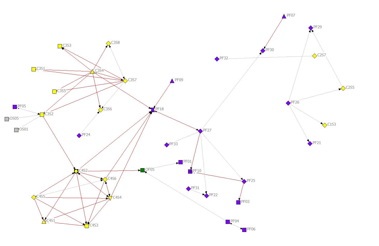
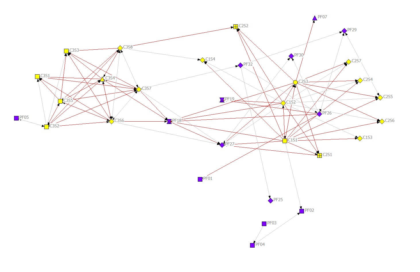
Figure 1 presents sociograms for one of the relationships defined as part of an IGERT evaluation as measured at two time points. Specifically, this relationship reflects whether participants reported that they designed or taught a course, seminar, or workshop together.
In this diagram, individuals (nodes) who share a tie tend to be close together, while individuals who do not share a tie tend to be farther apart. When drawn in this way, the sociogram reveals how people organize into clusters. Red lines represent interdisciplinary relationships, making it possible to see patterns in the connections that bridge disciplinary boundaries. These sociograms combine data from three years, so nodes do not move from one sociogram to the next. Nodes appear and disappear as individuals enter and leave the network, and the ties connecting people appear and disappear as reported relationships change. Thus, it is easy to see how connections—around individuals and across the network—evolve over time.
One shortcoming of this data display is that it can be difficult to identify the same person (node) in a set of sociograms spanning multiple time periods. However, with additional data processing, it is possible to create a set of aligned sociograms (in which node positions are fixed) that make visual analysis of changes over time easier.
Figure 1: Sociograms — Fixed node locations based on ties reported across all years
a) “Taught with” relationship year 4
b) “Taught with” relationship year 3
Approach 2: Circular/Elliptical Maps
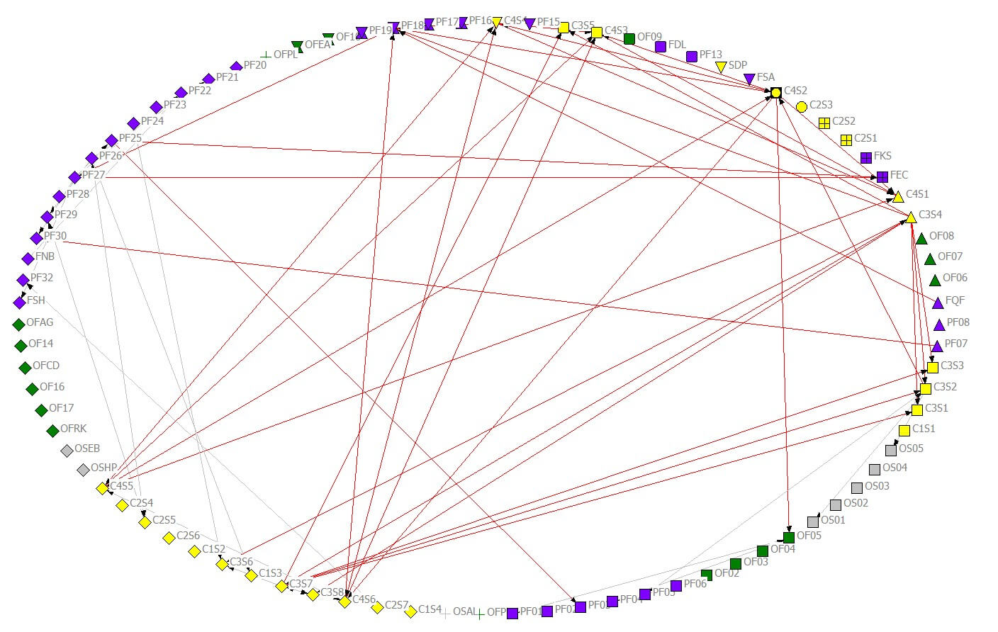
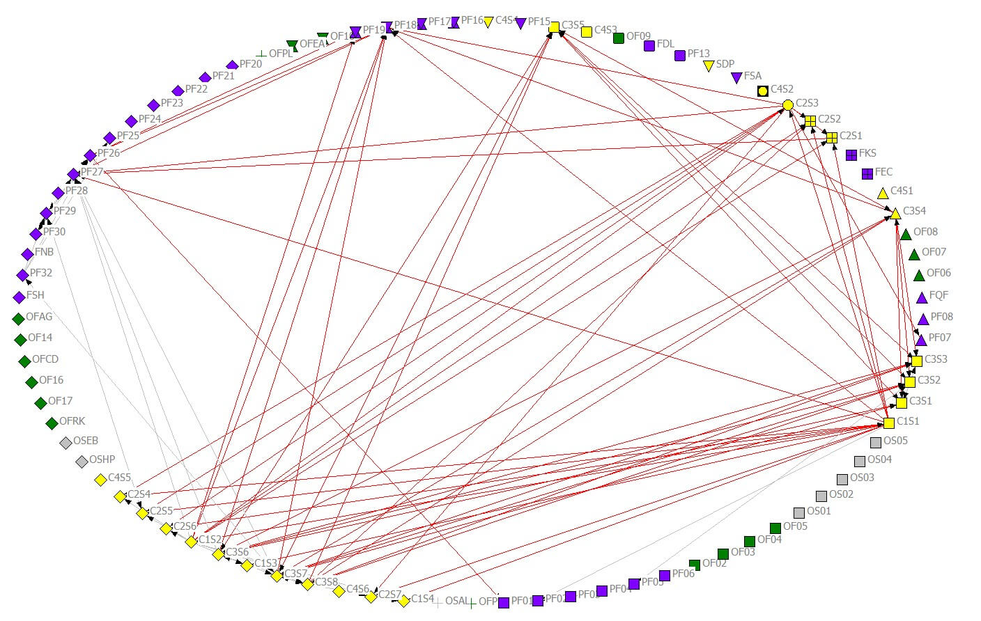
Figure 2 introduces another way to present a sociogram: a circular layout that places all nodes on the perimeter of a circle with ties drawn as chords passing through the middle of the circle (or along the periphery when connecting neighboring nodes). Using the same data used for Figure 1, Figure 2 groups nodes along the elliptical boundary by department and, within each department, by role. By imposing this arrangement on the nodes, interdisciplinary ties pass through the central area of the ellipse, making it easy to see the density of interdisciplinary ties and to identify people and departments that contribute to interdisciplinary connections.
One limitation of this map is that it is difficult to see the clustering and to distinguish people who are central in the group versus people who tend to occupy a position around the group’s periphery.
Figure 2: Sociograms—All nodes from all years of survey placed in a circular layout and fixed
a) “Taught with” relationship year 4
b) “Taught with” relationship year 3
Because both network diagrams have strengths and limitations, consider using multiple layouts and choose maps that best address stakeholders’ questions. Two excellent—and free—software packages are available for people interested in getting started with network visualization: NetDraw (https://sites.google.com/site/netdrawsoftware/download), which was used to create the sociograms in this post, and Gephi (http://gephi.github.io), which is also capable of computing a variety of network measures.

Rick Orlina 
Evaluation and Research Consultant Rocinante Research
Dr. Rick Orlina is an independent consultant and evaluator specializing in applications of social network analysis. His contributions are informed by broad career experience, including working as a social scientist in educational and national security research, and as an engineer in product design, manufacturing, and marketing. He holds an MBA from the Stanford University Graduate School of Business and a PhD in Learning Sciences from Northwestern University.

Veronica Smith
Data Scientist, Founder data2insight, LLC
Veronica Smith, trained as an evaluator, research engineer and architect, is a recognized leader in P-20 STEM education and workforce development, program evaluation, and data dashboarding for effective performance measurement. She founded data2insight in order to strategically partner with people and organizations to use data wisely to solve complex problems in the social, educational, environmental and health sectors. Ms. Smith holds a graduate certificate in the Advanced Study in Evaluation from Claremont Graduate University, a MSEE from University of Washington, and a Bachelor of Architecture degree from University of Arizona.

Except where noted, all content on this website is licensed under a Creative Commons Attribution-NonCommercial-ShareAlike 4.0 International License.


